
Case Study:
CarePath Icons
Case Study:
CarePath Icons
Product Goal
Product Goal
Product Goal
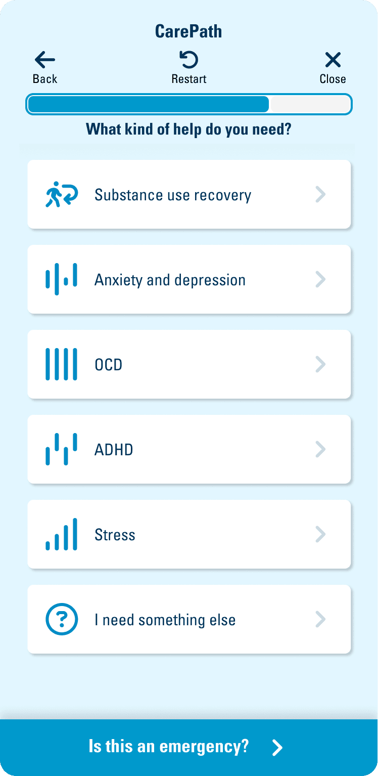
CarePath is a part of the MyHealth Toolkit app that is owned by BlueCross BlueShield of South Carolina (BCBSSC). The purpose of CarePath is to help members get connected with all the services and benefits that are part of their policy. Throughout the user flow members are prompted with questions that help to funnel them to different categories of care.
CarePath is a part of the MyHealth Toolkit app that is owned by BlueCross BlueShield of South Carolina (BCBSSC). The purpose of CarePath is to help members get connected with all the services and benefits that are part of their policy. Throughout the user flow members are prompted with questions that help to funnel them to different categories of care.
CarePath is a part of the MyHealth Toolkit app that is owned by BlueCross BlueShield of South Carolina (BCBSSC). The purpose of CarePath is to help members get connected with all the services and benefits that are part of their policy. Throughout the user flow members are prompted with questions that help to funnel them to different categories of care.
My Process
My Process
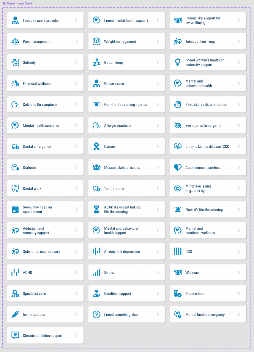
I designed the entire CarePath UI, but will not completely show it due to my ethical obligations to BCBSSC. The part I will focus on is the creation of icons for every card in the app. Most of them were sourced from fontawesome.com, but I also created icons. Several of the need types were challenging concepts to convey with stock icons. I focused on visually translating those concepts and medical conditions.
Since, some of the icons were from fontawesome.com I also took care to make sure any icons I created fit along with the established style. Some of the icons partially used fontawesome.com resources and then I supplemented them with an additional visual cue that made sense for specific medical needs.
When creating CarePath I kept in mind that members may be coming into this feature during the best and worst moments of their life. I wanted the app to feel light and quickly deliver the member to helpful solutions. I also felt a user would appreciate seeing different images associated with each need. Without the icons the app would have been lists of text and wouldn't have conveyed the feel of the app.
Empathy Focused
Empathy Focused
I wanted to approach the visualization of the medical needs in a way that would help alleviate or prevent negative emotions. I assumed that each need was possibly an emotionally charged subject. I wanted the icons to have a softer and partially abstract aesthetic.
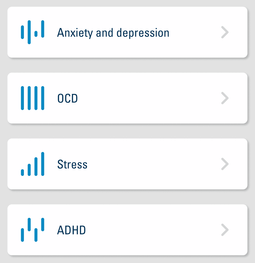
This vision was critical when creating the icons for mental health needs. I wanted to do my best to help the member feel like the app and BCBSSC understood their plight and was ready to help. I also wanted to make sure my visualizations didn't worsen someone's mental state. For these particular needs I made very minimalist icons. My goal was to convey the internal sensations and thoughts a member may feel.
I wanted to approach the visualization of the medical needs in a way that would help alleviate or prevent negative emotions. I assumed that each need was possibly an emotionally charged subject. I wanted the icons to have a softer and partially abstract aesthetic.
This vision was critical when creating the icons for mental health needs. I wanted to do my best to help the member feel like the app and BCBSSC understood their plight and was ready to help. I also wanted to make sure my visualizations didn't worsen someone's mental state. For these particular needs I made very minimalist icons. My goal was to convey the internal sensations and thoughts a member may feel.
Copyright © 2024 Richard Miller. All rights reserved.
Copyright © 2024 Richard Miller.
All rights reserved.
Copyright © 2024 Richard Miller. All rights reserved.